Сайты одностраничники или как их еще называют Landing Page появились не так давно, каждый посетитель интернета хотя бы раз посещал такой ресурс. Это сайты, состоящие из одной страницы, которую посетитель пролистывает вниз, получая необходимую информацию. Главное отличие Landing Page от обычного сайта-визитки состоит в том, что на нем находится минимум функциональных и структурных элементов. На самом деле лендинги призваны продавать. Это их главная и основная цель. Такие сайты возникли в то время, когда исследователи и маркетологи проанализировали статистику и поведенческий фактор посетителей стандартных сайтов и пришли к выводу, что пользователя интересует всего несколько значимых факторов. Так сайты избавились от мишуры и стали минималистичными, состоящими из одной страницы.
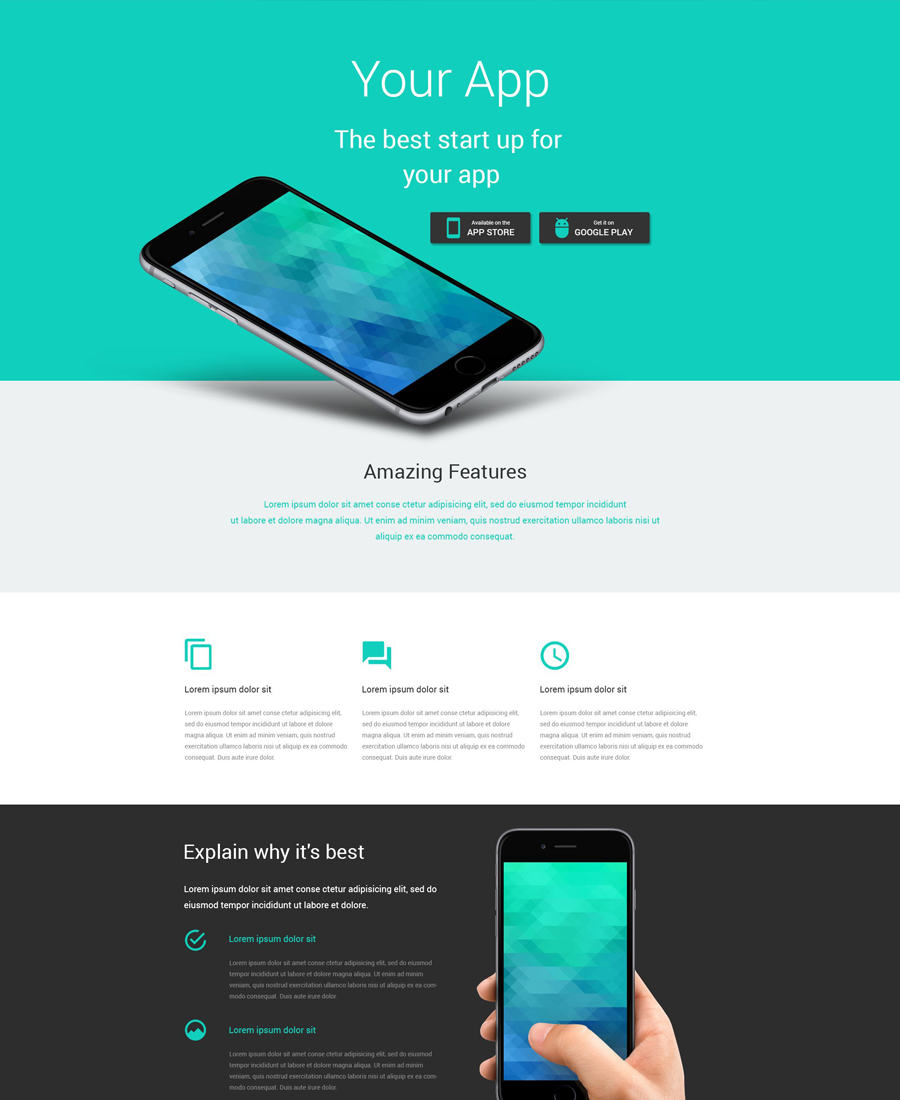
Из чего состоит Landing Page
Для современных Landing Page характерны следующие составляющие элементы и их комбинации.
Заголовок, привлекающий внимание . Является названием сайта, продукта или услуги, помогает пользователю понять, что это то, что он искал и остаться на сайте.
Картинка, слайдер или видео – чаще всего располагается в основной (верхней) части лендинга, чтобы ленивый пользователь, который не хочет читать, понял, что он зашел по адресу.
Уникальное торговое предложение – это чаще всего информация о товаре, услуге или инфопродукте, описывающая его особенности и преимущества.
Отзывы клиентов . В последнее время есть тенденция не доверять обычным отзывам на лендингам, поэтому клиенты изощряются и получают видеоотзывы, аудиоотзывы, а также сканируют рукописные отзывы своих покупателей.
Обратная связь (форма для оставления контактов).
Кнопка для действия «Купить», «Заказать», «Оформить», «Участвовать».
Примеры Landing Page
Рекламные целевые страницы содержат много информации о продукте (часто эта информация уникальная и структурированная, полезная для читателя). Посетитель такой страницы делает покупку только потому, что тратит много времени на сайте и хотел бы оправдать это.
Ягоды годжи
Примерами могут служить многочисленные страницы, созданные с целью продажи полезных продуктов и добавок для похудения, здоровья или красоты. Этот сайт продает капсулы из ягод годжи. Несмотря на то, что сами ягоды можно купить гораздо дешевле, здесь информация преподносится с позиции несомненной пользы и уникального состава данного препарата.

Бобровая струя
Вот, например, сайт, посвященный продаже биологически активного вещества – бобровой струи. Могу уверенно предположить, что многие читатели до этого момента даже не подозревали о таком веществе. Особенностью этого лендинга можно считать большое количество текстовой информации, которая полезна для читателя.

Лампочки
Еще один пример – информационная рекламная страница, посвященная продаже экономичных лампочек. Много внимания уделено информации о таких лампах, а также расчетам с наглядной экономией.

Гидроскутеры
Классический образец рекламного лендинга – сайт по продаже гироскутеров. Здесь представлены несколько моделей, есть фото, видео материалы, сводные таблицы с характеристиками, отзывы, и, конечно же, кнопки купить товар.

Билайн
Рассмотрим пример целевой лид страницы, которая создана профессиональными маркетологами для анализа спроса на конкретный товар или услугу, формирования маркетинговой стратегии. Удачным примером можно считать лендинг компании Билайн. Обратите внимание на минимум информации и ориентацию на конкретную группу клиентов.

Тинькофф
Не менее профессиональным можно считать лендинг банка Тинькофф, созданный под конкретный запрос (кредитные карты).

Apple
Из зарубежной практики невозможно не отметить дизайн целевых лид страниц компании Apple. Минималистичный современный дизайн с возможностью узнать первым о новинках корпорации.

Pepsi
Отдельной разновидностью лендинг пейдж можно считать вирусные страницы. Например, компания Pepsi в Украине запустила интересный проект – сайт, на котором можно было ответить на предложенные вопросы и добавить свою фотографию.

После прохождения теста и загрузки фото, на сайте появлялась машина времени, которая отправляла посетителя в прошлое. Результатом становились шуточные фотографии с названиями профессий, которые можно было расшарить в соцсетях с хештегом.

Очки
Вирусная целевая страница может быть полезной пользователю. Например, этот сайт – виртуальная примерочная очков. На таком лендинге можно без труда продавать очки известных брендов или копии.

Pokemon Go
На принципе вирусного маркетинга построена и знаменитая сейчас Онлайн-игра Pokemon Go, кто знает, может быть, она вдохновит вас на создание лендинга, в котором посетители будут искать мелких и редких покемонов на карте?

Тренды и перспективы Landing Page
Основным трендом лендингов в 2016 году можно назвать внедрение вирусного маркетинга. Владельцу сайта важно не просто получить посетителей, а заставить их делится информацией о своем сайте в соцсетях, с друзьями, в личных сообщениях. Также заметна тенденция к выбору минималистичного дизайна, продиктованного тем, что пользователь не желает долго ждать, пока загрузится страница. Немаловажным является и сосредоточение внимания на мобильной версии лендинга, так как все большее количество людей используют смартфоны для веб серфинга.

Визуальные эффекты, которые были популярны в 2015 и 2016 году, остаются востребованными и совершенствуются. В каталоге свежих шаблонов лендинг пейдж TemplateMonster можно отыскать смелые современные решения для самых разных бизнесов. Здесь есть трендовый параллакс эффект, придающий динамичность странице, адаптивный дизайн – красивый на всех устройствах, разнообразные виды анимации, фоновое видео, Lazy Load. Также пользователи смогут без
проблем реализовать на своих сайтах разнообразные функциональные возможности – онлайн чат, галерея, калькулятор и так далее.

Заходите на http://www.templatemonster.com/ru/landing-page-templates-type/ и выбирайте понравившийся вариант посадочной страницы. Это реальная возможность протестировать вашу бизнес идею недорого, быстро и эффективно.
With the purpose of saving you time and effort on the creation of a landing page, we have decided to share this compilation of 30 responsive landing page templates , which are ready to go, out of the box. Some of them were even enhanced with live drag-and-drop builders, which will make your web development much faster and worry-free.
Look through the list, maybe your perfect landing page design is included here?
1. Mobile Repair Service (Page builder included)
This fully responsive landing page template was built in a clean, flat style, which allows you to bring your content to the forefront. Bold colors and retina ready images make it easier to separate different content blocks from one another. Readable typography and bold headlines provide for better readability on the page.
Best suited for entertainment and holiday planning web pages, the template looks really impressive. An abundance of high-quality images create a festive atmosphere on the page. Neat icons and readable fonts make it easier for the web audience to scan your content and understand your objectives. It’s one of the most stylish landing page templates by TemplateMonster .
3. Education (Page builder included)

The header of this landing page template welcomes visitors with a simple sign-up form. The clean layout has been enhanced with the smart use of white space, providing for better readability of your content. Flat icons and clear pricing details guide the users through the basic education programs that you provide. The theme is fully integrated with social media, which frees you from the necessity of manual installation of third-party plugins.
4. Real Estate (Page builder included)

This landing page template is intended for effective presentation of your latest projects and new offerings on the web. A large hero area, integrated with blurred video background, serves as a great attention getter. Neat icons added on top have been enhanced with hover effect. Photo galleries, built-in contact form and Google map support are intended to provide the web audience with explicit information about your business.
5. Financial Advisor (Page builder included)

Financial, business and accounting projects can benefit from this professionally built landing page template. If you have loads of content that you would like to present in a logical and well-balanced way, then the clean and concise layout of this financial advisor landing page template is just what you need. Fully customizable, responsive and crossbrowser compatible, it will present your business in a most favorable way.
Special Offer (Expires on May 20, 2016)

Each of the aforementioned 5 landing page templates is available for $19, but the good news is that these five templates are included in one bundle , which you can download for as low as $39 by entering a coupon code LANDING .
Important: the coupon code will expire on May 20th, 2016.
By the way, each template in the bundle is pre-loaded with a drag-and-drop builder, which helps you tweak the layout without touching a line of code.
6. Car Repair

This fully adaptive landing page template has been pre-loaded with a number of smart customization options, which will help you get started in no time. HTML plus JS animation will help you create a truly remarkable web presentation. Parallax scrolling background and lazy load effect will not only enhance your page’s visual appeal, but also speed up its loading.
7. Hotels

The functional yet effective look of this theme will fit hotels, travel, real estate, exterior and interior design web projects perfectly. Scrolljacking technique, which was integrated into this template, makes it both trendy and user-friendly. The users do not need to scroll up or down the page in search of desired content. Instead, they can reach any sought after data with just a click.
8. Construction Company
Non-standard layout of this theme and eye-catching color palette will appeal to every visitor. The theme’s framework is highly adaptable and can adjust flawlessly to any screen size on which it is being viewed. Packed full with multiple customization options, the theme is also very versatile – you can pick it for any project that you have in mind.
9. Home Repairs

Maintenance service companies can create a professional business image on the web by means of this well-coded landing page template. Flat style makes the page easy to scan. While directing the main focus on content, the theme’s developers enhanced the layout with handy booking and contact forms.
10. Flooring

Creativity and style – this is how the template can be described in two words. In fact, the layout has been created in a way that will exude professionalism and a non-standard approach to your interior design company. Images and texts make up a perfect balance on the page, letting users enjoy your creative works while running through the easy-to-follow texts.
11. Business

A sticky menu in the template’s left sidebar facilitates the page’s navigation to a great extent. Providing the users with a quick overview of all the key pieces of content that you share, it also allows your visitors to navigate to any desired information with a click. A built-in contact form has been added to the theme’s header, inviting every visitor to reach out to you for more details.
12. Corpexa

Professionally designed and built with clean, valid code, this business landing page template demonstrates usability across a variety of devices. Equipped with a usable admin panel, the theme also features a variety ofadvanced customization options, which will make it easy for you to adapt the template to your specific needs. Google web fonts, online chat and subscription form have also been added to the pack.
13. Medical

Easy-to-reach contact details and an integrated contact form, easy to scan content, user testimonials, and a list of programs – this landing page template features everything that you need to build trust and attract the web community. The vivid red color scheme is a great attention getter, which evokes curiosity and a thirst for new information.
14. 87 Landing Theme

Breathtaking animation makes this business landing page template more spectacular. Though the color scheme of the layout looks traditional for this type of web project, the parallax scrolling and hover effects that appear as you move your mouse on the page, simply cannot leave anyone indifferent. Enumerated content blocks provide for better page readability.
15. Dance Studio

This responsive one-page template will work well for representing dance, sport, adventure and travel projects on the web. Rich in visuals, it captivates the users with storytelling. The main navigation panel remains fixed to the top of the page, letting the users navigate to any content with a click. Thanks to the integration of lazy load effect, the users will enjoy the speed of your page’s loading on any device.
16. Psychologist

The calm and relaxing atmosphere on the page, that was achieved mainly through full-width video integration and pleasing-to-the-eye color scheme, makes it a perfect fit for medical and healthcare websites. Google map integration, as well as easy to reach contact details, make it very easy for the audience to reach you. Social sharing options provide them with a quick way of getting in touch with you through social media.
17. Steelworks

This landing page template is best suited for industrial websites. The clean and concise layout was enhanced with parallax scrolling backgrounds. Rhombic shapes and non-standard content positioning allow you to create a more eye-catching presentation of your company, its products and services. Readable fonts and large headings make the page more user-friendly.
18. IQ Business
Creative and innovative, the template is intended to present your business project with style. Running on a fully responsive framework, it will adjust all content to multiple screen resolutions flawlessly. Developed with valid HTML/CSS practices, the theme is also SEO-friendly, which guarantees you high page ranking in the search results.
19. Bank

The pixel-perfect design of this landing page template, with the integration of flat style elements, will work really well for presenting accounting, financial and business projects on the web. In addition to some quick information about the company, the header has been enhanced with a full-width video background. Making contact is easy to accomplish. To add a feeling of confidence to the presentation, the theme features user testimonials and a list of accepted payment methods.
20. Software
If you are looking for a ready-made solution to present your software project effectively to the web community, then consider the following theme. Metro style enhances its visual appeal. Direct download links were put in the theme’s header, inviting every visitor to try it out on their own. Stunning animation and lazy load effect make the theme more user-friendly. Video integration and interactive photo gallery will help you introduce your offerings to the audience in a better way.
21. Travel Agency

The template was created specifically to present hot tours and beautiful destination points in a captivating way. An integrated booking form was placed in the theme’s header, inviting every visitor to make a quick reservation on the site. Stunning hover animation and parallax scrolling images will get the web audience immersed in the atmosphere of your agency.
22. Real Estate Agency

This fully featured landing page template will work well not only for real estate but also for design and hotel businesses. A photo heavy layout is best suited for presenting this type of content in the most favorable light. Advanced animation, parallax scrolling effect, image hovers and lazy load effect have all been integrated into the package. If you wish to tweak the layout, this can be achieved easily from the theme’s dashboard.
23. Fashion

Fashion studios and creative photographers can use this theme to present their talents to the online community in an outstanding way. A full-width video background in the header serves as a great attention getter. A contact form above it invites every visitor to approach you for details. Clean and minimalist layout with plenty of white space brings the users’ attention to your portfolio.
24. Car Dealer

Full-width photo backgrounds featuring the parallax scrolling effect let web users get into the atmosphere of your business once they land on your page. Scrolljacking effect adds a sense of interactive functionality to the layout. By clicking any of the items in the theme’s vertical carousel, the users will be taken to the various types of content in the blink of an eye.
25. Home Remodeling

This template is ideal for creating landing pages for construction and industrial companies. Clean and concise design adds more professionalism to their online presentation. Valid code and a fully responsive framework will make the page run flawlessly across a variety of devices.
26. Italian Restaurant

The key purpose of any food-related website is to stimulate the appetite of every user who reaches it. For landing pages, this factor is of tremendous importance as well. This Italian Restaurant template has been pre-loaded with mouthwatering dishes on the menu, which demonstrate your refined cuisine at its best. Following your restaurant’s menu, a quick reservation form and integrated Google map allow you to establish contact with your prospective clients.
The clean and professional style of this theme will help you create a trustworthy business presentation on the web. Spacious layout and a neutral color scheme provide for better readability of your content. Though the page is not rich in various types of content, it introduces the users to the key data that they need to know about you – a couple of words about your company story, services and contact details.
29. Cafe and Restaurant

The stylish and elegant design of this landing page template is intended for presenting singers, music bands and other creative professionals on the web. The layout is diverse in multiple types of content. Here you can share a playlist of your latest singles. The theme has plenty of space for sharing your upcoming tours’ schedule and even highlighting some of the top-selling branded clothes.
Final Words
These have been 30 of the coolest landing page template s that we recommend you consider using for creating a stunning presentation of your business on the web. Feel free to try how each of them looks and feels by checking out their live demos.
If you think that there are other cool landing page templates that are worthy of being mentioned in this list, feel free to share your thoughts below this post. Your feedback is highly appreciated!
Note: This is an update of a piece originally published in late 2014 by Will Hoekenga. The landing page trends we predicted in that post aren’t brand new trends anymore-in most cases, they’re the new status quo. To see our list of 15 modern landing page must-haves and make sure your own landing pages are up to date,
It’s important to be able to create landing pages quickly for a lot of reasons.
It’s important because you want to be able to execute your ideas as soon as they’re thought through. You want to be able to make the most of time-sensitive promotions and put out a page whenever a new opportunity comes up. And it’s been well established that the more landing pages you create, the faster your business is likely to grow.
It’s also important for a simpler reason: things move pretty fast in online marketing. And I can guarantee you that most landing pages from even five years ago-even pages that were effective when they were built-are going to stick out like a sore thumb today. Or, at the very least, fail to consistently produce results.
Customers’ habits have evolved, and so has our understanding of what motivates them and what can be done to increase conversion rates. Unlike fashion trends or even general web design trends, landing page trends don’t seem to come and go and cycle back. Once something becomes outdated, it tends to stay that way.
On the other hand, once something’s been proven to work, it becomes so widely adopted (at least among the most tuned-in marketers) that it hardly counts as a landing page trend anymore. It’s just a best practice.
About a year and a half ago, we published a post identifying 15 trends that were emerging at the time. Just about every one of them has become a best practice by this point-in fact, we’ve incorporated them into a new guide, called “15 Must-Haves for Modern Landing Pages.” If it’s been a while since you thought critically about your landing pages, or if you’d just like to make sure they’re positioned to stand up to your best competitors’ pages, download your free copy here:

It doesn’t just tell you something about what the page offers-it evokes the state of mind (cozy yet adventurous) the company desires to stir in its subscribers.
Whenever inspiration is a critical part of your marketing strategy, it’s worth thinking beyond the obvious imagery and thinking about how a happy customer or subscriber should feel . Your background image could help transport them there more quickly.
Trend #5: Ultra-Compact PPC Landing Pages
Google “how to build a store online,” and you’re likely to see a PPC ad bringing you to this sharp landing page from (which is also a good example of Trend #1 above):

In fact, if you spend much time clicking through PPC ads from top companies, you might notice that on the whole they seem to be growing leaner, condensing themselves into powerful one- or two-screen marketing engines. There’s no possible way you could miss what this page is about, and there’s nothing to do here but opt in.
One image. One call to action. Heck, there are only two pieces of copy that even qualify as a complete sentence-forget about dense paragraphs.
Why are pages like this popping up in paid search? I think it has to do with the deeper understanding of visitors you can gain by targeting certain kinds of search queries.
If I’m searching “how to build a store online,” I don’t need to be told why building an online store is good. I’m probably not just trying to satisfy my curiosity. (My hobbies aren’t quite that weird.) I’m searching that phrase because I’m ready to take action and build an online store, and a page that helps me take that action easily is likely to earn my business.
Even Shopify’s branding is subtle here, consisting of color use, a logo, and a sandwich of social proof: a mention of their 300,000-strong customer base on top and a press section at the bottom. And speaking of social proof …
Trend #6: Free-Range Testimonials
I used to see them all the time: pages in a company’s navigation bar with titles like “Our Clients,” “Meet Our Happy Customers,” or just “Testimonials.”
I think marketers began to realize that few people were clicking on pages like this, because eventually those faded, in place of testimonials sections embedded in larger pages.
Those can definitely add value, but there’s a further evolution here: sprinkling testimonials throughout your landing page to support or amplify certain points you want to drive home.

First, the page shows off a snapshot of the kind of screen a restaurant professional might see on the job. Then, below, it isolates different elements of that interface to point out special features-saying much more than words alone or stock restaurant images could do.
Trend #11: Step-by-Step Structures
It seems like landing page creators are getting smarter and smarter at presenting complex information simply. The tactic above is one method. Another is simply laying out how your product works in a series of numbered steps.
Mixergy introduced this layout to their welcome landing page after working with Bryan, and it seems to have proven successful-they’ve stuck with it since then:

By placing your navigation links here, you serve return visitor (or customers) who need them while ensuring nobody else gets distracted before they reach the end of the page.
What Landing Page Trends Are You Noticing?
Some of these strategies and techniques are extra twists on long-acknowledged principles of marketing; others are a little more surprising. If you’re trying to use landing pages to accomplish similar goals to the examples above, it’s worth testing these trends for yourself.
To help make sure your landing pages are solid as can be before you try something new, don’t forget to download our PDF guide, “15 Must-Haves for Modern Landing Pages.”
Free Download: 15 Must-Haves for Modern Landing Pages
If you have , you don’t need to download this template – it’s already available to you inside your LeadPages account. Just and you’ll see how super easy it is to customize this page in seconds with no technical knowledge or skills, make it mobile responsive, integrate it with your email service provider or CRM, run A/B split tests, and publish it to Facebook, WordPress, or your own server.
What trends are you seeing in landing pages right now? Are there any you would add to this list? Leave a comment below.
В этой статье мы рассмотрим 5 примеров лучших лендингов, взятых с behance.net, признанного мировыми дизайнерами самым популярным сайтом по веб-дизайну, иностранными заказчиками для поиска разработчиков и лучшим для вдохновения и черпания новых идей.
Ниже представлены лучшие лендинг пейдж, которые прошли отбор, непосредственно, нашей веб-студией. Мы взяли ТОПовые работы на сайте и выбрали landing page с наиболее эффективными продающими структурами, ведь именно продающая структура является главным преимуществом лендинга.
Дамы и господа! Знакомьтесь, самые крутые и лучшие продающие лендинги 2017-2018 по версии и популярного сайта behance.net.
Примеры лучших лендинг пейдж
Чтобы упорядочить примеры лучших лендингов, мы решили разбить их на блоки, свойственные продающей странице. Мы рассмотрим УТП, описание продукта, выгод и преимуществ, блок доверия и СТА на примерах отобранных лендингов. Вы сможете увидеть варианты оформления и структуры, почерпнув для себя ценную информацию и новые идеи.
Уникальное торговое предложение
Первый пример УТП лучшего лендинга 2019 года - фирма по продаже стульев.
Первое, что бросается в глаза - это фотография товара. Стильный стул действительно привлекает внимание, которое разжигается уникальным торговым предложением. Заметьте, УТП в этом случае нестандартное, отсутствуют какие-либо факты о компании или выгоды покупки. Но при этом мощный продающий текст и качественное изображение делают свое дело - повышают интерес посетителя, в чем и заключается принцип продающей структуры. Стоит сразу сказать, что то самое преимущество продукта размещено на втором и третьем слайде первого экрана.


Каждый слайд содержит фотографии товара с разных ракурсов и описание к нему. Очень мощный ход, который мотивирует читателя проскроллить страницу чуть ниже. Смотрите больше примеров посадочных страниц и черпайте новые идеи для своего проекта.
Следующий пример лучшего, по нашему мнению, лендинга - посадочная страница фирмы по продаже меда

Сочно, ярко, интересно. Очень крутой дизайн первого экрана. При этом уникальное торговое предложение раскрывает главное преимущество - экологичность продукта. УТП написано в мягкой форме, но при этом вызывает доверие.
Следующий пример лучшего лендинга

Первый экран совместил в себе УТП, предоставляющее ценность потенциальному клиенту, а также небольшой список кратких преимуществ. Очень интересно сделан снимок продукта, который на подсознании вызывает желание сделать заказ. Что, в общем-то, и предлагает эффективный лендинг на первом экране.

Первый экран с УТП содержит текст, вызывающий интерес, 3 преимущества производителя, СТА с кнопкой и видео, позволяющее узнать больше информации о компании. Экран оформлен красивым фото меблированного интерьера, подчеркивающее эксклюзивность продукта.
Еще один пример крутого landing page

Сразу бросается в глаза абсолютная нечитабельность текста. Зачем разработчики оформили текст белым цветом на белом фоне остается загадкой. Но, повторимся, лучший леднинг - тот, у которого четко проработана продающая структура, а этот пример работы относится именно к таким. Стильный экран с не очень эффективным еле просматриваемым УТП. К сожалению, фотография услуги компании не дает представление о ее деятельности - большой промах разработчиков.
Хотите узнать больше о УТП? Читайте статью с рекомендациями по созданию УТП на сайте Импульс Дизайн.
Описание продукции
На первом примере посетителю предоставляется возможность просмотреть вариации продукта и выбрать его вид. Блок очень удобен с точки зрения пользования. Все фотографии из каталога размещены в виде слайдеров, есть кнопки выбора цвета коробки и приведены примеры готовых работ. Посетитель визуально понимает что ему предлагают. Если он решился на заказ продукта, поможет ему в этом кнопка "Заказать".

Следующий пример описания продукции лучшего продающего лендинга содержит большие и яркие фотографии и категории.

Кроме того, для удобства посетителя предусмотрена лидогенерирующая кнопка. Она "убивает" сразу двух зайцев. Посетитель получает интересующую его информацию, а компания - клиента.
Продающая структура лендинг пейдж должна заключать в себе удобство для пользователя. Удобство во всем: принятии решения и его выполнения, просмотре товара. В случае со следующим примером описания товаров удобство пользования раскрывается на 100%.

Во-первых, представлены виды продукции, во-вторых, под каждым видом есть лидогенерирующая кнопка. При наведении мышкой на стул, меняется фотография и продукт представляется в другом положении, что помогает пользователю понять принцип эксплуатации продуктом и его вид.
Следующий продающий леднинг содержит полный каталог продукции, предоставляемой компанией. Отдельный плюс - красивое оформление и соответствие цветов общей тематики сайта.

Лаконичность - лучший друг лендинга. И следующий пример лучшего лэндинга это подтверждает.

Стильно и скромно, на белом фоне сделан акцент на фото и небольшое описание улуги с лидогенерирующей кнопкой. Остальные услуги сделаны в виде активных ссылок, при кликании на которые открываются другие фотографии с описаниями, соответствующие услугам.
Выгоды и преимущества на одностраничнике
Выгоды и преимущества фирмы для клиента являются эффективной мотивацией. Как правило, преимущества размещаются в начале сайта для разжигания интереса пользователя, а выгоды - ближе к концу, подталкивая посетителя к целевому действию. Оба блока должны содержать ценную информацию, отвечать на вопросы, подавлять страхи потенциального клиента. Рассмотрим на примерах крутых landing page.
Преимущества


Оба блока раскрывают ценности фирмы и конкретного товара. Читатель понимает где можно использовать продукт, его качественные характеристики. В качестве дополнения продемонстрированы конкурентные преимущества самой компании.
Следующий лендинг объединил в себе преимущества и выгоды. Читая и просматривая контент, пользователь убеждается в профессионализме производителя, что подавляет его основной страх - получить низкокачественный товар. Этот триггер демонстрирует лучший пример конверсионного лендинга .


В этом же блочке внедрена фишка, повышающая доверие пользователя к компании - видеоролик, который подробнее расскажет о производителе.
Аналогичное совмещение выгод и преимуществ показывает и следующий лендинг.

В этом случае устраняются страхи. Потенциальный покупатель знает, что натуральный мед - дикая редкость. В случае с одностраничником подтверждается натуральность продукта цифрами. Кроме того, пользователь может получить информацию о продукте, кликнув на кнопку и связавшись с представителями компании.
Еще один блок преимуществ выполнен в очень стильном дизайне и, в целом, довольно интересен. Просматривается профессионализм дизайнера, что однозначно привлекает внимание.

Казалось бы, преимущества можно описать 4 словами "Доставка по всей России", но графическая карта добавляет лендингу уникальности. К тому же, сама карта имеет тематическую направленность, что делает лендинг ну очень крутым.
ТОП лучших лендингов содержит интересные и эффективные решения. Следующий landing имеет небольшой блок преимуществ, который размещен сразу под блоком с УТП. Блок выгод оформлен отдельно и отвечает клиенту на вопросы стоимости, а также усиливает желание за счет скидок.

И еще один продающий лендинг, который раскрывает преимущества компании и выгоды для клиента. В качестве преимуществ описан принцип работы компании, который подавляет существующие страхи.

Усиливается желание благодаря небольшому блоку выгод

При этом компания демонстрирует выгоды для клиента не только тем, что использует во время процедуры качественные продукты, но и намекает о том, что косметика в продаже. Чему и свидетельствует кнопка с СТА.
Блок доверия на посадочной странице
Блок доверия не является обязательным требованием для лендинга, в отличие, например, от блока call-to-action. Однако он помогает пользователю решиться на целевое действие. Ведь лендинг, исходя из своей специфики, не предусматривает большое количество информационного текста о компании. Следовательно, лучше, если блок доверия будет реализован другими способами. Посмотрим как с этим справились ТОПовые лендинги.
Вариант 1. Отзывы

Очень практично и удобно размещен блок отзывов на сайте. Отдельный плюс - фото реальных людей: не моделей, не снимков людей, откровенно взятых из Интернета.
Вариант 2. Видео

Пожалуй, видео - один из самых эффективных способов повлиять на человека. Видеообращение всегда повышают доверие из-за прямого контакта с пользователями, которые уже стали клиентами и передают свои эмоции "вживую".
Вариант 3. Фотографии
Очень часто в качестве повышения доверия размещаются фотографии реальных специалистов, которые работают в компании. В нашем случае принято решение разместить реальные фотографии салона. Глядя на них, создается впечатление элитности. А элитное не может быть низкокачественным. Следовательно, доверие к компании усиливается.

На сладкое. Призыв к действию (СТА)
Первый лендос имеет "сочный" СТА, оформленный в едином стиле с сайтом. Желание сделать заказ усиливается скидкой.

Единственный минус - блок размещен в середине страницы. В идеале, нужно было разместить еще один призыв в самом конце, вместо этого добавлены небольшие кнопки, которые не сразу бросаются в глаза.
Следующий призыв к действию содержит не только лидогенерирующую кнопку, но и дополнительные выгоды для клиента. Очень продуманный призыв.

Завершает наш обзор еще один призыв к действию, оформленный в сочных тонах, привлекающих внимание.

Подведем итоги
Как видите, продающая структура продающей страницы является главным и мегаважным инструментом для повышения конверсии сайта. Нельзя сказать какая из структур, приведенная в лучших лендингах, будет наиболее эффективной. Скажем только одно: каждая структура должна максимально соответствовать потребностям целевой аудитории и максимально раскрывать преимущество компании/продукта/услуги. Добавьте к этому стильный и яркий дизайн, и вы обязательно получите ошеломляющую конверсию лендинга . Ну, а если вы пока не в силах создать свой продающий одностраничник, вы всегда можете заказать landing page у нас .
На этом все! Ставьте лайки и подписывайтесь на наш блог, чтобы не пропустить самое интересное.
This article was contributed by Alice Jackson & Patrick Cole.
First impressions matter! This is why it is important to know the latest landing page design trends. Let’s take a look at where we are at in 2016.
Take a look at the Google trends graph that clearly shows how interest for ‘creative landing pages’ has been steadily growing since 2009. You can also see some landing page software reviews here that compares different services for building successful landing pages.

This is because marketers and professionals are aware that a creative and unique landing page can boost conversation rate dramatically . (Tweet this)
An eye-catching landing page is something every business craves, as it is the best way to convert strangers on your site into paying consumers.
Given the ever-increasing competition on the web, optimization of your landing page is crucial for capturing a visitor’s attention, as well as increasing traffic . Having a well-designed and intuitive landing page is a must for any business.
You could also offer various services such as free trials or coupons for your product or service through your landing page to your customers, and gather information such as their name and email. This is, of course, just one of the many features you can add on your landing page to increase leads.
Below we take a look at 7 landing page design trends for 2016, that you need to know to stay ahead of the curve.
1. Auto Play Full-Screen Video Background
This trend of having full screen videos or images as background is already being used widely by many businesses. Having such a landing page is a treat for the eyes, as videos pack in enough punch to entertain, and engage your visitors. More and more marketers are using this technique for drawing visitors deeper into their websites since it gives them an opportunity to convey their message about the product or service much more easily. If you have an entertaining video, there is little chance the user will hit the back button. For instance, check out the landing page of Walabot .
2. 3D Parallax Storytelling

Parallax scrolling is one of the biggest design trends at the moment and has been for a quite some time. It gives the user a 3D effect as they scroll down the page. According to Hubspot, a parallax effect on a website is when content scrolls at different speeds, creating a sense of perspective and depth . If done in the right way, it can engage and entertain your users and help convey your message step-by-step . Tech giant, Sony used parallax scrolling to excite its users, while providing them information about the brand in their now removed ‘Be Moved’ campaign. Here, you can see a video of how the site reacted to scrolling.
Navigation should always be user-friendly but there is no harm in trying out a different method from the usual scrolling . See this post for more . You can have a standard navigation bar on the top or you can try a unique style. For example, have a look at the landing page of Kurka Wolna . It mesmerizes the users with its unique style of providing information while the user scrolls anyway. It is actually engaging!
3. Branded Illustrations

Your aim should be to create a landing page which stands out from the crowd. Instead of using images or videos, you can use illustrations to tell something about, or related to, your product or service. With a unique illustration style, it will give site visitors the feeling of you being different from other websites .
4. No Navigation Bar
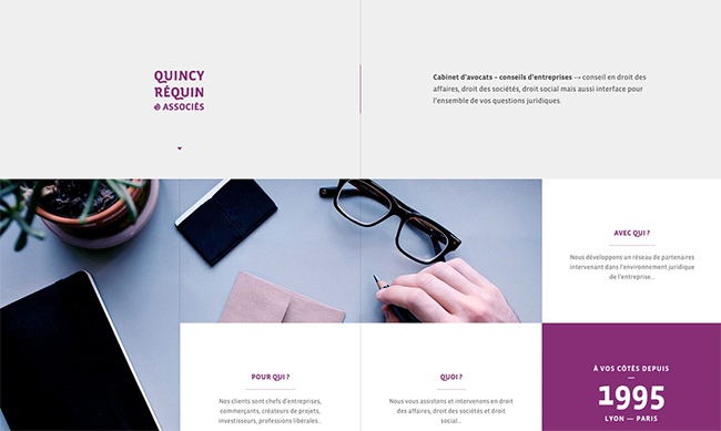
Navigation bars no doubt make things easy for users to find what they are looking for, but removing the navigation bar or trying a different navigation method on your landing page may make your audience spend some more time on your site .
They won’t get distracted by looking at different navigation icons and can focus on what information you have provided them with. This is exactly what Quincy Réquin & Associés legal site have done on the landing page of their site. Each link connects you to a page which provides specific, targeted information. It is their logo design which catches the eye of site visitors when they first land on the page.
5. Super Simplification

This trend is here to stay. Simplicity is the key to success, right? Though there are a lot of options available, as discussed above, a simplistic design can often communicate much better as it allows the user to focus on the content at hand . For instance, take a glance at this simple yet elegant landing page: Kalium . The focus is on the work, with a simple clear statement at the header of the page, free of other words or clutter. Take a look at your designs and see what can be taken away.
6. Split Screens
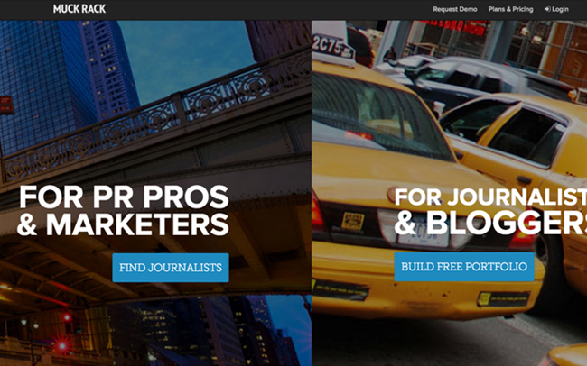
Often a website has multiple target audiences and what better way to split an audience than have a split screen? A good example of this Muck Rack ‘s landing page which splits the page between marketers and bloggers. CoSchedule goes even further and has a pop up when you scroll down the page with 3 choices which then loads the next section of the page.
Before people make the decision to purchase something or even to subscribe to a mailing list, they usually want to vet out the business that they are dealing with. One of the most common ways to do this is to read about the experiences that others have had. In most cases, this is done by reading product review websites, and by asking peers on social media.
The only problem with this is that when a customer is on your landing page, the last thing you want is for them to be clicking on another tab and diverting their attention to another website. This is why including social proof directly on the landing page is a trend that will increase in popularity in 2016.
Social proof can be added to a landing page using many different options these include:
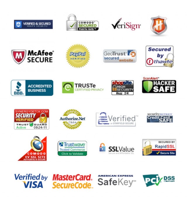
- Adding badges and ratings from professional and regulatory organizations such as the BBB
- Quotes from satisfied customers
- Endorsements from influencers
- Subscriber and social media counts
- Logos of well known clients
- Media Logos
Each of these items provides proof of quality of products and services and can significantly increase the level of trust that visitors have.
